Social media is here to stay and there’s a ton of competition for online businesses. So, creating stunning social media designs that capture your audiences’ attention and get them to engage is the only way to get results.
You can easily learn how to make your own social media design with simple-to-use software and ready-made templates. You don’t have to be a graphic designer or have any experience. Instead, you can use The Graphics Creator with easy drag and drop graphics, templates, and tools.
Just follow these six simple ideas that’ll show you how to make attention-grabbing designs to help you grow your business through social media.
Idea #1- How to Make a Social Media Profile Image and Cover Design That Are Complimentary
These go hand in hand. Of course, you can just use a stunning banner and personal profile picture, which is a fine idea if “you” are the focus of your brand.
However, many companies choose to use an image, usually a secondary logo, for their profile pictures (instead of a photo) to further brand them on social media.
Apply this idea to your overall social media design by using an object or design that is the same color, font, or look and feel as your cover image.
Take a look at the banner and profile image that we created with The Graphics Creator for Laughingbird Software’s Facebook page.
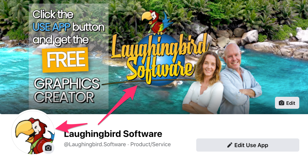
This Facebook banner includes our tropical look and feel as well as our primary Laughingbird logo. However, we use a smaller secondary logo for the profile picture. And we still include our personal photo in the banner graphic to further showcase our brand.
The most important thing for all of your own social media is to create a design that perfectly represents your company and overall brand. This will help your business stand out and get recognized.
This is why it’s necessary to make every graphic on your page or account compliment each other.
Idea #2- Use Consistent Colors and Fonts Throughout Your Social Media Designs
Another simple but important basic design idea to follow is this: Use only 2-3 main colors and 1-2 fonts in each image (but you can add a logo with another font to give you some wiggle room).
As touched on above, you’ll want every social media post to be easily recognized as your brand. Therefore, include your logo and other graphics that are unique to your company. You may even want to create your posts with the same one or two fonts each time.
One of the biggest mistakes that you can make as an online business owner is to use only free stock photo images that aren’t personalized with your brand in any way. Yes, I know that cuts down on creation time even further but it’ll be much harder to stand out on social because thousands of other people are using that image as well.
Here’s a better idea: Instead of just using a photo, add your logo, brand colors, fonts, and/or additional graphics to make each image super unique. You’ll rapidly speed up your design by starting with one of The Graphics Creator’s design templates.
Each graphic image you post on social media that includes consistent colors, fonts, logo, and graphics will build your company brand.
In the design example below, we use a stock photo but we make our image totally unique to our brand with our logo and colors. And we stick to a maximum of three main colors and two fonts.
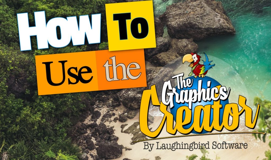
Of course, if you use a stock photo as a background, you’re likely to have several secondary colors. This is okay, as long as they are subtle and in the background.
But in this image, you can see that the main colors are yellow/ orange (we use varying shades) and white. These are the same main colors as in our logo, with blue being a secondary color.
Further, only two main fonts are used, in addition to the script font in the logo. Our logo is rather large in this image because it’s part of the image’s title. This is one easy idea to make your design unique and stand out.
But look what happens when we create an ad and instead pull out the blue from our logo to use as a primary color:

In this graphic, we pull out the blue color from the sphere on the logo to use as the primary color. Further, two main fonts, Roboto Slab and Roboto Condensed are used.
Idea #3- Pair Contrasting Fonts in Your Graphic to Grab Attention
Almost any design you post on social media can use two fonts. Even in a simple quote, you can use one font for the quote and a different font for the attribution (who said it).
Yes, I know choosing fonts can be a bit overwhelming at first! If you’re not sure which fonts to pair up, try these ideas:
- A simple way to start is to pair a Serif font with a Sans Serif font.
- Check out what others have done… if it catches your attention, then use the same or similar fonts.
- Have fun playing around a bit. Try pairing contrasting fonts but stay simple. Pair a standard font with a more unique one, like a script font (as in the image below). Or, consider making one font larger and/or a different color to make it pop!
- Finally, a super easy way is to get the right fonts is to use professional pre-designed templates with the fonts already chosen for you.
With The Graphics Creator, I designed this pin with two stunning and contrasting fonts to make sure that it stands out in the Pinterest feed. Notice that there are only 2 colors in addition to the main black text.

One other great idea to help you contrast fonts is to change the size, width, or color of the font.
So, you can use just one or two fonts but make the word you want to emphasize bigger, fatter, or a different color. You can even change the background color of one of the words.
Look at how you can implement this idea in The Graphics Creator with the Text Styles tool:
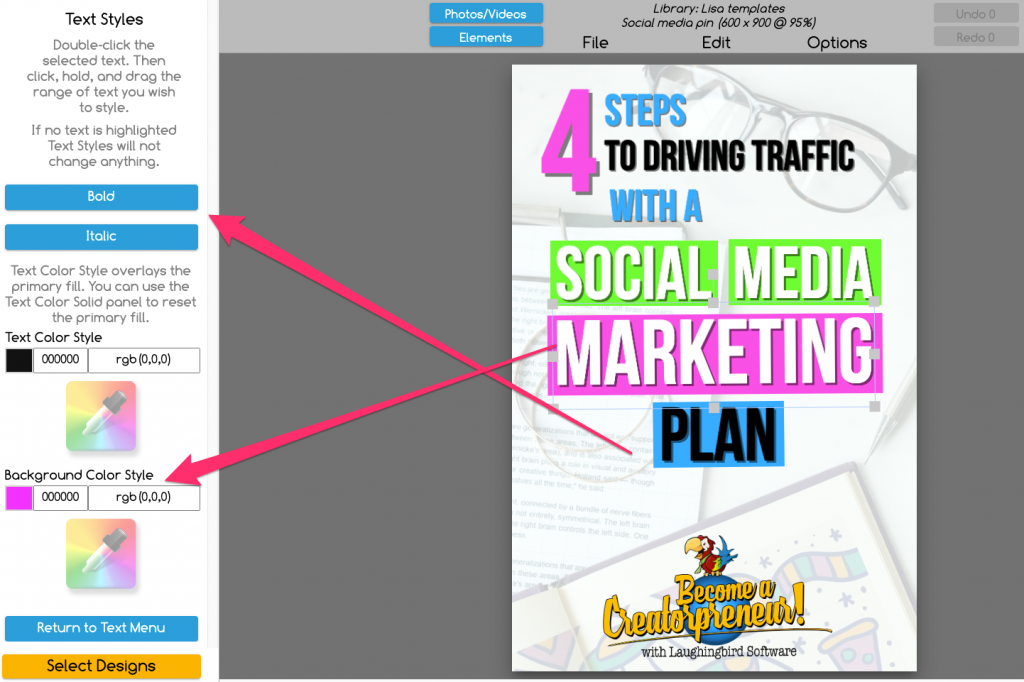
You can have fun with this and really play around with colors and using fonts until you find what works. And it’s never a bad idea to ask others what they think.
Idea #4- Match Your Text Color With One From Your Image or Background Color
Colors in your design should tie your brand together and create a look and feel that draw out the emotions consistent with your brand’s purpose.
As an example, try setting your text in the same color as one of the background or image colors.
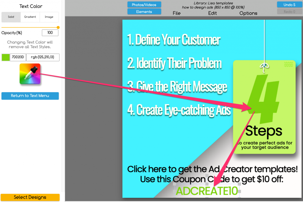
Using the color picker tool found in The Graphics Creator makes this easy:
Just click on (highlight) the text you want to color match.
Then click on the color picker icon as shown in the image below. Now click on any part of your image that has the color you want to use for the text.
You can try out multiple colors from the background until you find the perfect one.
Idea #5- Use Transparent Images or Backgrounds In Your Designs So That Your Message Stands Out
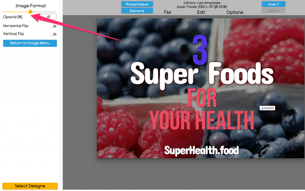
This is an easy idea to get your design to stand out. When using any background or stock photo, you can make sure that your text, and therefore your important message are easily readable just by changing the opacity.
In other words, you can apply transparency to (or fade) your background image. Just use the “Opacity” slider in The Graphics Creator.
Experiment with different levels of transparency. Just slide it up and down until you get the desired effect. Sometimes you’ll need to choose a different photo to make it perfect.
And there’s’ another way to use transparency to help your message stand out that’s pretty cool.
Use a transparent shape layered between your text and the background image! It’s easy:
- You can select a colored shape by clicking on the elements tab.
- Or, to make it even easier, just select “New Rectangle” (or another shape) from the “Edit” menu. Then you can use the “Opacity” slider to make it more or less transparent and even change the color.
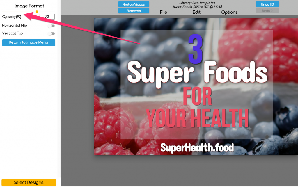
This transparency idea will take away some of the distractions from the background and allow your text to really pop!
Idea #6- Add Your Logo on Every Social Media Graphic!
First, create a personalized, branded logo, if you haven’t already. Make it unique and use similar colors and fonts as in your overall brand design.
Use The Graphics Creator’s Logos and Business Card templates to make it quick and easy. Plus, make multiple logos to try out and see which one looks best on all of your social media.
Then use your logo everywhere: On every social media design, in every account, and on each social profile. You’ve seen a couple of different ways that I’ve used the Laughingbird Software logo on a graphic.
Try the same ideas. Just make sure you’re placing your logo on the image in a place it won’t get hidden once you post it. Each social media platform has their own buttons and icons in places that could obscure your logo.
Take a look at another post to see where they are before you place your logo on your graphic. For example, on Pinterest, I recommend putting your logo on the bottom, center of each pin.
How to Get Extra Creative on Social Media with Eye-Catching Design
Design templates help you to make every day social media designs fast and easy. But that doesn’t mean your creativity is limited!
If you’re just starting out with The Graphics Creator, you’ll probably want to stick with the templates for a bit. However, you can learn simple design skills and helpful tricks at the same time.
In fact, you’ve already learned how many fonts and colors to use in each design and how to pair contrasting fonts. But when you’re ready to learn more you can check out Laughingbird Software’s Creatorpreneurs blog for more creative ideas and tips.
And you can learn some amazing tricks and creative ideas in Laughingbird Software’s video tutorials.
Social media graphics are the perfect time to get as creative as you want! Plus, the more creative you get, the more unique your designs will be.
Here are just 3 creative ideas to get you started designing creatives for your social media:
- Make Photoshop-like effects such as reflections… perfect for inspirational images and quotation posts.
- Cool layering effects to get attention on Facebook, Twitter, or Instagram.
- Create end screens and thumbnail graphics for YouTube!
And use all of the creative tools available, including the background removal tool, color-picker, “Shapes” feature, easy font selection, stock photo search, animated graphics, and more.
Start making amazing social media graphics now: Grab the templates you need (they come with a free version of The Graphics Creator software)!
