Text in a Circle Generator

Have you tried out the text in a circle creator tool in The Graphics Creator? This gives you the ability to quickly and easily place text around an object for your next design masterpiece.

How the Text Circle Generator Works

Circle text works a bit differently than normal text and this new feature can be found under the “Insert” menu. Just choose the Text Circle option.  This opens a new menu for the Text Circle. 

From here, there are a bunch of additional controls you can use to make changes to get exactly the look you want.

You can scale the size of the circle to fit around an object, rotate the text around the circle, and adjust both the font size and the spacing between the letters.

Text Circle Adjustments

Normally, in The Graphics Creator, you change the text by double clicking. But when you’re using the Text Circle generator, it works a little differently. 

You add the text you want to show on the circle in the box at the top of the Text Circle menu. To make adjustments to the font, text color, and text effects, choose the blue box at the bottom of the circle text option “Return to Text Menu”.  This takes you to the Text Menu where you can make all the adjustments to the font that are normally available in our graphics maker.

Under Text Format, you can choose which font you’d like to use.  If you have the downloadable version of the software, you can choose a system font.  However, Google fonts are available if you are using The Graphics Creator online. 

After choosing the font you’d like for your project, select the Return to Text Menu option.

You can manipulate the look of the text by selecting the Text Circle Format option which will take you back to the Text Circle menu.  Here you can scale and rotate the text.  You can also adjust the character spacing which will change how the letters spread around the circle.

You can also move the text from the top of the circle to the bottom.  Text in the Top position will be along the outside of your circle and text in the Bottom position will be within the circle.  Text in either position can be adjusted for font and spacing as you’d like.  You can choose to have the top circle text in one font and the bottom circle in another like we did in the example photo.

You will probably have an image you’d like your text to circle around.  To adjust the text so it fits around your object you need to adjust the scale of the circle.  Adjusting the scale will not change the type or size of your text, only the circle.  Under the text, you will see a thin blue line that represents the circle your text is on.  You can use this blue circle to get the size and placement set.

How to Change the Size of the Circle Text

First, there is a sliding adjustment in the Text Circle menu.  If you need to a finer adjustment, place your mouse cursor on the small yellow dot on the scale slider.  Click this small circle and it should enlarge to indicate that you are using this feature.  Simply tap your arrow keys to enlarge or reduce the circle one unit at a time until the circle is the size you need.

Inside The Graphics Creator, we have a number of great templates for you to choose from, but only a few offer a circular text design.  However, you can easily use the Circle Text feature to include text within any template you’d like.

Select the template you would like to use then insert a new Text Circle.   Proceed as before by adding the word or words you’d like into the text box.  Adjust the font type, size, and color to the font used in the template, or choose a new font to match your project.  Remember that you can scale the circle to fit around an image and you can rotate the text into position.

Have a good time using this creative feature in the Graphics Creator.  We’d love to see how you use the circular text to create your images, so please share your designs with us by posting in the LaughingBird Software Facebook group.

How to Wrap Text in a Circle with The Graphics Creator

Today, we’re proud to announce that The Graphics Creator Software can now wrap text in a circle!

You don’t need Photoshop, or Gimp, or Canva. All you need is The Graphics Creator by Laughingbird Software.

The Graphics Creator is downloadable software for both Mac and Windows computers. AND, there’s an online version that you can use with any browser, anytime… and from any place.

Watch the video on creating text on a circle with The Graphics Creator.
Comment below to let us know what you think of this awesome new feature!

The Graphics Creator has become the easiest way to create your own designs and social media graphics . It’s used all over the world for content marketing and visual communication.

It’s the best Photoshop and Canva pro alternative on the market… PLUS, it’s way easier than Photoshop and way more flexible than Canva.

And… as with all Laughingbird Software products, you’ll have access to our Creatorpreneurs Academy: Learn smart money tactics and creative marketing strategies – every week!

Learn how to make circle text with The Graphics Creator Software by watching this short video
Share on Pinterest!

Using Ready Made for You Graphics Templates

Want to know how to use the ready made templates inside the Graphics Creator?

Watch this: HOW TO USE THE GRAPHICS CREATOR – Part 9

In this mini series of short videos, I’ll walk you through using the tools and working your way up to creating some amazing graphics with Laughingbird Software.

In Part nine, you’ll learn how to use the pre designed templates that come with the software. I’ll walk you through using the “Done for you” templates and show you how to utilize the Youtube templates, logo and business card templates and more!

. —————— Other videos in the series: ——————

Part 1 (The intro): https://youtu.be/l7Jv4iYNGls

Part 2 (Modifying the text): https://youtu.be/Nzn00H83pdM

Part 3 (Formatting text): https://youtu.be/tv9Tqomnq6Q

Part 4 (Using the built in graphics and importing your own): https://youtu.be/mYUIifbcY9I

Part 5 (Creative tricks with graphics): https://youtu.be/EHrj4gLtVQw

Part 6 (Using the Canvas and the Menus): https://youtu.be/NdDKjC1iw4s

Part 7 (Creating a “reflection effect”): https://youtu.be/5gMUlGRSj6M

Part 8 (Saving and organizing your designs): https://youtu.be/QnROda1PWJ0

Part 9 (The finale – Using the “Done-for-you” templates! which is what you’re watching right now)

After watching this series, you’ll be able to create social media graphics, or, create your own graphics! You’ll get tips for creating some high quality social media designs and how to use the ‘done for you’ templates.

we have some more in-dept ‘Tutorial Tuesday’ videos. The Graphics Creator is downloadable Software for Windows and for Mac computers. …We also have an online “in the cloud” version that anybody can access.

The Graphics Creator, content marketing, visual communication and creative design. AND, its easier to use than Photoshop or Canva pro! It’s digital marketing made easy. The Graphics Creator Software has become the easiest way to create your own designs and social media graphics . It’s used all over the world for content marketing and visual communication. (It’s the best Photoshop and Canva pro alternative on the market).

And! With all Laughingbird Software products, You’ll have access to our ‘Creatorpreneurs Academy’! Learn smart money tactics and creative marketing strategies – every week!

Follow my blog with Bloglovin

How to Make Social Media Design: Six Easy Ideas for Businesses

Social media is here to stay and there’s a ton of competition for online businesses. So, creating stunning social media designs that capture your audiences’ attention and get them to engage is the only way to get results.

You can easily learn how to make your own social media design with simple-to-use software and ready-made templates. You don’t have to be a graphic designer or have any experience. Instead, you can use The Graphics Creator with easy drag and drop graphics, templates, and tools.

Just follow these six simple ideas that’ll show you how to make attention-grabbing designs to help you grow your business through social media.


Idea #1- How to Make a Social Media Profile Image and Cover Design That Are Complimentary

These go hand in hand. Of course, you can just use a stunning banner and personal profile picture, which is a fine idea if “you” are the focus of your brand.

However, many companies choose to use an image, usually a secondary logo, for their profile pictures (instead of a photo) to further brand them on social media.

Apply this idea to your overall social media design by using an object or design that is the same color, font, or look and feel as your cover image.

Take a look at the banner and profile image that we created with The Graphics Creator for Laughingbird Software’s Facebook page.

An example of a Facebook page banner graphic with matching profile image.

This Facebook banner includes our tropical look and feel as well as our primary Laughingbird logo. However, we use a smaller secondary logo for the profile picture. And we still include our personal photo in the banner graphic to further showcase our brand.

The most important thing for all of your own social media is to create a design that perfectly represents your company and overall brand. This will help your business stand out and get recognized.

This is why it’s necessary to make every graphic on your page or account compliment each other.


Idea #2- Use Consistent Colors and Fonts Throughout Your Social Media Designs

Another simple but important basic design idea to follow is this: Use only 2-3 main colors and 1-2 fonts in each image (but you can add a logo with another font to give you some wiggle room).

As touched on above, you’ll want every social media post to be easily recognized as your brand. Therefore, include your logo and other graphics that are unique to your company. You may even want to create your posts with the same one or two fonts each time.

One of the biggest mistakes that you can make as an online business owner is to use only free stock photo images that aren’t personalized with your brand in any way. Yes, I know that cuts down on creation time even further but it’ll be much harder to stand out on social because thousands of other people are using that image as well.

Here’s a better idea: Instead of just using a photo, add your logo, brand colors, fonts, and/or additional graphics to make each image super unique. You’ll rapidly speed up your design by starting with one of The Graphics Creator’s design templates.

Each graphic image you post on social media that includes consistent colors, fonts, logo, and graphics will build your company brand.

In the design example below, we use a stock photo but we make our image totally unique to our brand with our logo and colors. And we stick to a maximum of three main colors and two fonts.

Of course, if you use a stock photo as a background, you’re likely to have several secondary colors. This is okay, as long as they are subtle and in the background.

But in this image, you can see that the main colors are yellow/ orange (we use varying shades) and white. These are the same main colors as in our logo, with blue being a secondary color.

Further, only two main fonts are used, in addition to the script font in the logo. Our logo is rather large in this image because it’s part of the image’s title. This is one easy idea to make your design unique and stand out.

But look what happens when we create an ad and instead pull out the blue from our logo to use as a primary color:

Examplae of social media ad using company brand color of blue as primary color in ad

In this graphic, we pull out the blue color from the sphere on the logo to use as the primary color. Further, two main fonts, Roboto Slab and Roboto Condensed are used.


Idea #3- Pair Contrasting Fonts in Your Graphic to Grab Attention

Almost any design you post on social media can use two fonts. Even in a simple quote, you can use one font for the quote and a different font for the attribution (who said it).

Yes, I know choosing fonts can be a bit overwhelming at first! If you’re not sure which fonts to pair up, try these ideas:

  • A simple way to start is to pair a Serif font with a Sans Serif font.
  • Check out what others have done… if it catches your attention, then use the same or similar fonts.
  • Have fun playing around a bit. Try pairing contrasting fonts but stay simple. Pair a standard font with a more unique one, like a script font (as in the image below). Or, consider making one font larger and/or a different color to make it pop!
  • Finally, a super easy way is to get the right fonts is to use professional pre-designed templates with the fonts already chosen for you.

    With The Graphics Creator, I designed this pin with two stunning and contrasting fonts to make sure that it stands out in the Pinterest feed. Notice that there are only 2 colors in addition to the main black text.
Find out the 6 Social Media Design Ideas you Need for Marketing Your Business
Image created with The Graphics Creator. Share this pin on Pinterest!

One other great idea to help you contrast fonts is to change the size, width, or color of the font.

So, you can use just one or two fonts but make the word you want to emphasize bigger, fatter, or a different color. You can even change the background color of one of the words.

Look at how you can implement this idea in The Graphics Creator with the Text Styles tool:

Change the style of your text using the Graphics Creator
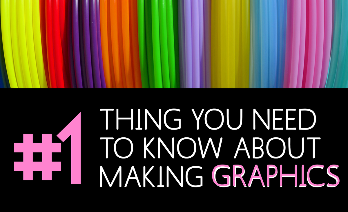
See how the pink background was added to the word “marketing”, which is also bigger than the other text?!

You can have fun with this and really play around with colors and using fonts until you find what works. And it’s never a bad idea to ask others what they think.


Idea #4- Match Your Text Color With One From Your Image or Background Color

Colors in your design should tie your brand together and create a look and feel that draw out the emotions consistent with your brand’s purpose.

As an example, try setting your text in the same color as one of the background or image colors.

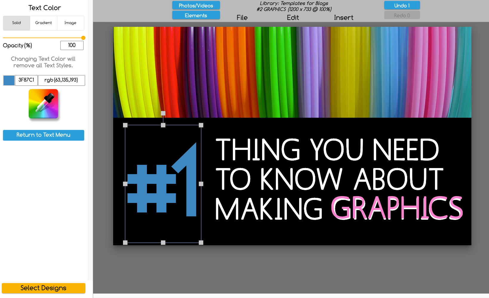
Using the color picker tool found in The Graphics Creator makes this easy:

Just click on (highlight) the text you want to color match.

Then click on the color picker icon as shown in the image below. Now click on any part of your image that has the color you want to use for the text.

You can try out multiple colors from the background until you find the perfect one.

Shows how you can pull a color from the canvas to use on other text or graphics

Idea #5- Use Transparent Images or Backgrounds In Your Designs So That Your Message Stands Out

This is an easy idea to get your design to stand out. When using any background or stock photo, you can make sure that your text, and therefore your important message are easily readable just by changing the opacity.

In other words, you can apply transparency to (or fade) your background image. Just use the “Opacity” slider in The Graphics Creator.

Experiment with different levels of transparency. Just slide it up and down until you get the desired effect. Sometimes you’ll need to choose a different photo to make it perfect.

Using the Opacity tool to change the background transparency
Sliding the opacity down helps the red text pop out!

And there’s’ another way to use transparency to help your message stand out that’s pretty cool.

Use a transparent shape layered between your text and the background image! It’s easy:

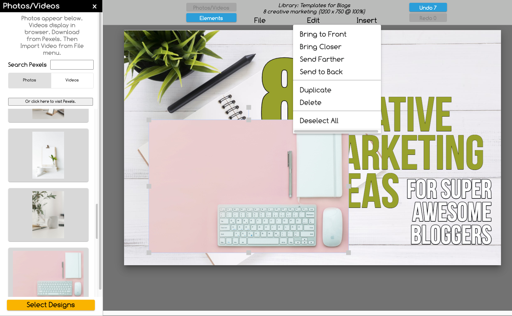
  1. You can select a colored shape by clicking on the elements tab.
  2. Or, to make it even easier, just select “New Rectangle” (or another shape) from the “Edit” menu. Then you can use the “Opacity” slider to make it more or less transparent and even change the color.
How to use a transparent shape and chnage it's opacity  in The Graphics Creator

This transparency idea will take away some of the distractions from the background and allow your text to really pop!


Idea #6- Add Your Logo on Every Social Media Graphic!

First, create a personalized, branded logo, if you haven’t already. Make it unique and use similar colors and fonts as in your overall brand design.

Use The Graphics Creator’s Logos and Business Card templates to make it quick and easy. Plus, make multiple logos to try out and see which one looks best on all of your social media.

Then use your logo everywhere:  On every social media design, in every account, and on each social profile. You’ve seen a couple of different ways that I’ve used the Laughingbird Software logo on a graphic.

Try the same ideas. Just make sure you’re placing your logo on the image in a place it won’t get hidden once you post it. Each social media platform has their own buttons and icons in places that could obscure your logo.

Take a look at another post to see where they are before you place your logo on your graphic. For example, on Pinterest, I recommend putting your logo on the bottom, center of each pin.

How to Get Extra Creative on Social Media with Eye-Catching Design

Design templates help you to make every day social media designs fast and easy. But that doesn’t mean your creativity is limited!

If you’re just starting out with The Graphics Creator, you’ll probably want to stick with the templates for a bit. However, you can learn simple design skills and helpful tricks at the same time.

In fact, you’ve already learned how many fonts and colors to use in each design and how to pair contrasting fonts. But when you’re ready to learn more you can check out Laughingbird Software’s Creatorpreneurs blog for more creative ideas and tips.

And you can learn some amazing tricks and creative ideas in Laughingbird Software’s video tutorials.

Social media graphics are the perfect time to get as creative as you want! Plus, the more creative you get, the more unique your designs will be.

Here are just 3 creative ideas to get you started designing creatives for your social media:

  1. Make Photoshop-like effects such as reflections… perfect for inspirational images and quotation posts.
  2. Cool layering effects to get attention on Facebook, Twitter, or Instagram.
  3. Create end screens and thumbnail graphics for YouTube!

And use all of the creative tools available, including the background removal tool, color-picker, “Shapes” feature, easy font selection, stock photo search, animated graphics, and more.

Start making amazing social media graphics now: Grab the templates you need (they come with a free version of The Graphics Creator software)!

The Graphics Creator Software screen

How to Make Stunning Pinterest Pins: DIY in Minutes

If the stress of needing new beautiful pins weekly for Pinterest is getting to you, then it’s time to make some changes. It’s no fun having to constantly pay others to create pins for you or to feel overwhelmed by making your own.

I’ll show you how to easily make stunning Pinterest pins in just minutes all by yourself, even if you don’t have ANY design experience.

To help you quickly create amazing new pins each week, I’ll walk you through answering the questions that’ll make it easy and fast!

  • Why Do I Need New Pins on Pinterest (and LOTS of them?)
  • What is the Best Size for My Pinterest Pins?
  • What Images Should I Use to Create My Pins?
  • How Can I Brand my Pinterest Pins?
  • How Do I Make Pin Images That Get Shown in Pinterest Search?
  • How Can I Create Multiple Pins at Once?
  • What Should I Write in My Pin Descriptions?

Follow along below and you’ll get answers to each of these questions and discover exactly how to make amazing pins for Pinterest in just minutes.

Why Do I Need New Pins on Pinterest (and LOTS of them?)

Pinterest experts have said repeatedly that you need to pin new visual content regularly. This is because Pinterest keeps users on the platform by showing them fresh content (aka: new pins).

Therefore, it’s not surprising that they’re going to show new pins in the search feed much more often than older pins.

Sharing new content doesn’t mean that you have to write blog posts daily however. It just that you need to create new ways of bringing attention to your content. And designing and publishing a LOT of new pins is the way to do that!

What Is The Best Size for My Pinterest Pin?

Pinterest states that the “aspect ratio” (the ratio of width to height) should either be 2:3 or 1:2.1. However, 2:3 seems to be optimal, and this is what you’ll see most often.

Essentially, it’s a vertical pin that fits nicely on the screen of a mobile phone. For the last few years, pins that were 600 X 900 pixels were recommended. However, recently Pinterest is suggesting 1000 X 1500 pixels to make sure you get the best image quality.

So, here’s what I suggest… don’t use anything smaller than 600 X 900 and don’t use anything bigger than 1200 X 1800, especially if you’re going to include pin images on your site (because they may make your site load more slowly, which can frustrate visitors and decrease search rankings).

And no matter what, make your pins at a 2:3 ratio. Otherwise, your pins could actually get cut off in the Pinterest feed.


Create stunning Pinterest Pins here

What Images Should I Use to Create My Pins?

This is a very important question and there are two major things to consider here:

  1. Is my image unique?
  2. Do I have permission to use this photo or graphic?

Pinterest doesn’t want pinners to make pins that look like each others. They want users to to search a topic and be presented with lots of different pins.

So, you need to make your pins with unique images.

Unfortunately, free stock photos are used by many, meaning that your pin’s image won’t be unique if you use them. But no worries. You have some great options.

You can get the free stock photos and simply enlarge them to use only a fraction of the photo. This’ll give the images a different perspective that won’t look the same as others.

Another awesome alternative is to use a graphic background. I don’t mean a boring, plain colored background. You can use backgrounds with subtle patterns and images like this:

This is an example of a Pinterest pin designed using a subtle but unique graphic background instead of a stock photo

Or this…

Example of a pin using colored graphics instead of photos

Or you can make your pins really stand out among the rest with incredibly unique motion backgrounds. Publishing video pins on Pinterest will get you more views and engagement than standard pins because Pinterest prioritizes them in the pin feed.

And you don’t have to spend hours producing a video… instead, you can just drop a motion background on your pin image.

To find out more about creating the perfect motion video pin… go here.

You can also add graphics over your stock photos, or just use a variety of graphics without a photo.

Finally, don’t forget to make sure you have permission to use the stock image or graphic on your pin (or on your blog post or website).

Wherever you search for images, make sure to read the license agreements to see what you’re allowed to do with those images. And if you’re really set on a certain type of image, you’ll be way better off spending a few dollars on it than paying a fine for using it illegally.

How Can I Brand My Pinterest Pins?

You want to make pins that viewers recognize and remember. You’ve already spent a great deal of time building your business and its brand. Here are two things you can do to ensure that your brand is consistent on Pinterest and attractive to your viewers:

  1. Every time you create a new pin, make sure to put your logo or brand markings on it.
  2. Consider using your brand’s colors and look and feel on each of your pins (however this is optional… see below).

When putting your logo on your pin, you’ll want it to be fairly small. It shouldn’t take over the pin, but it should make your pin easily recognizable as your own.

Here’s an example…

Example of including logo on Pinterest pin
Example of a pin adding the business logo

The exception to this is when you want to use your logo as the main image to make your brand front and center. However, it would be smart to use your logo as the main image only once or twice. Otherwise, Pinterest may not see each pin as a new design.

Also, avoid placing your logo or brand marking in the lower right hand corner due to Pinterest’s own tool icons.

Now you might want to make your pins look similar to each other. This is another way to get your brand recognized.

However, because pins on Pinterest are published individually and end up being spread out over thousands of searches, they’re not always going to be seen side by side. And most users aren’t going to go look at your boards to see if your pins match.

Therefore, it’s totally reasonable to create new pins with many different colors, images, and designs to see what gets the most engagement from your Pinterest viewers. After all, this is what we want more than anything!

You can see that I make pins with different images and colors. I do this because I want my pins to stand out among all of the pins that tend to look the same.

And don’t be afraid to use bright colors for your images. There is absolutely no reason to make your pins look like so many others… with faded, muted colors and a flowing script font (that’s hard to read by the way).

How Do I Make Pin Images That Get Shown in Pinterest Search? And Fast?!

Unique images will get shown in the Pinterest feed more often. That’s the bottom line. However, there are some basics rules to follow:

  1. Your images should relate to your topic.
  2. You should only use text on the image that relates to your topic (don’t use images with random words somewhere in the image)
  3. The text on your image should include 1 or 2 of your main keywords.
  4. Make sure to name your pin’s image using keywords when you save it.
  5. Be inspirational, helpful, and clear about what you’re offering!

How to Design Your Images

So how do you design unique Pinterest pins in just minutes?

This is an easy DIY task when you have modifiable and reusable templates at your fingertips. You can create pins and publish them fast.

And you won’t have to try to explain what you want to anyone else or wait several days for your new pins!

Some of the Pinterest templates you'll find in The Graphics Creator software
20 of the 50 templates included in The Graphics Creator Pinterest Templates.

Simply select a Pinterest template from The Graphics Creator.

Then decide what you need to change to make a personalized pin for your topic:

  1. You’ll definitely need to re-write the text.
  2. You might also want to change the background or the text’s font.
  3. Choose the perfect text and graphics colors to match your background image.
  4. Add your own logo (your logo should’ve been saved as a transparent PNG)

You can easily learn to create your own graphics, including Pinterest images, by watching The Graphics Creator’s brief Getting Started tutorials.

You can easily modify a template by changing text and images.
Graphics Creator software canvas: Change the text color, fonts, background images, colors, and design elements.

What To Write on Your Pins

You can’t learn how to make stunning Pinterest pins in minutes without knowing what to write:

  1. Always include 1-2 keywords or your main keyword phrase.
  2. Write a Call-to-Action (if appropriate)

You might simply add the title of your article, which would already include your keywords (I hope!).

However, it’s more important that you use keywords found directly from Pinterest. These are the keywords people are searching for on Pinterest… and they might be different from what you’d find people searching for on Google.

To search for Pinterest keywords, just type in phrases you think searchers might be looking for on your topic. If those words or phrases come up automatically, you’ve found a keyword that people are searching for.

Then, consider adding a call-to-action, if it fits and you want viewers to take an action other than just to read your article. Tell people what you want them to do. Make an offer to give out something of value or tell them to sign up for your course.

But don’t overcrowd your pin’s image with text. It’ll make it harder to read and your important keywords might not stand out.

If you don’t have a call-to-action on your pin, make sure you have one on your website!

How Can I Create Multiple Pins at Once?

Creating multiple pins at once is easy. This is often called “batching.” Batching your pins saves you time and a ton of money when you’re making your own pin designs.

So, once you have created your first pin, simply save it. In The Graphics Creator, you’ll use “Save As” and give this second pin a new name.

Now, if this pin is for the same article, change the background image or graphics slightly to make it unique (new colors maybe?). Also, change up the text a bit. Perhaps add in a different keyword. And, finally, try out a different call-to-action.

Each new pin created from the original pin needs to be seen clearly as a different and unique pin.

What Should I Write in My Pin Description?

Now that you have made all those stunning pins and are ready to publish them, you want to make certain that Pinterest, and your viewers, know what your pin is all about.

Write a long pin description using your keywords and keyword phrases. Basically, just tell everyone what your pin is about in causal language (like you’re telling a friend).

Add your brand name and a call-to-action, especially if you didn’t include it on your pin image. Tell viewers what you want them to do when they get to your site.

Make your offer sound exciting or inspirational, including as many details as possible. You’ve got up to 500 characters which should be plenty to write a detailed pin description.


Create stunning Pinterest Pins here

Learn how to create your own pins for Pinterest. DIY design in just minutes. And make a video pin by adding a motion background. Grab your templates here and get started!
HELP OTHERS… SHARE THIS PIN ON PINTEREST!

How to Create Your Own Brain Teaser Images with Answers

4

Brain teasers are fun, challenging, and super helpful when it comes to engagement and attention. More importantly, visual images of riddles and puzzles can help businesses and educators meet their goals much easier than a string of words.

But trying to find the puzzle pictures that meet your needs is frustrating and sometimes impossible.

This is because brain teaser pictures may be of poor quality, use images or design elements that don’t make sense for your purpose, or may even be illegal to use due to copyright ownership.

The simple solution is to create your own brain teasers. Making them is easy and gets you exactly what you want and need. Just pick a template, drag and drop the images, change the text, and you’re done!

No matter whether you want to use one for business, education, social media, or just for fun, you can make a picture puzzle and answer graphic in just a few minutes.

And I’m here to show you how. I’ll help you decide which brain teasers you need and show you how to create your own visual brain teaser with a separate image for the answers.

Decide Which Type of Brain Teaser Image You Want to Create

There are several types of brain teasers that can be in the form of puzzles or riddles.

Each type might be used for different reasons although all are good for sharpening the mind and encouraging concentration as well as provide entertainment.

Decide which of these 4 types works best for you:

  • Logic: Here you must follow the logical steps in order to solve the problem.

    Example: Your mother’s brother’s only brother-in-law is asleep on your couch. Who is asleep on your couch?

  • Mathematical: Math is a globally understood language. But that doesn’t mean these are easy to solve.

    Example: One family wants to get through a tunnel. Dad can make it in 1 minute, mom in 2 minutes, son in 4 and daughter in 5 minutes. No more than 2 persons can go through the tunnel at one time, moving at the speed of the slower one. Can they all make it to the other side if they have a torch that lasts only 12 minutes and they are afraid of the dark?

  • Lateral: These types of brain teasers require more creative thinking.

    Example: If you were to put a coin into an empty bottle and then insert the cork into the neck… How would you remove the coin without removing the cork or breaking the bottle?

  • Word-Tricks: These riddles are often much more simple than they seem.

    Example: What can travel around the world while staying in a corner?

Whichever type you choose, you’ll want to create a picture image of it, rather than just posting it in word format. Just think about which one you’d rather solve?

A boring word riddle like this:

A woman was 70 years old in 2000 but just 60 years old in 2010. How can this be?

Or an easy-to-read, colorful picture riddle like this?!

How to Design a Brain Teaser Image All By Yourself

It’s unlikely that you’re reading this because you want to create just one brain teaser. You most likely want to have access to ongoing puzzles and riddles for your business, social media, or your classroom.

By making them yourself, you’ll be able to match your brand’s color, add your own logo on it, or choose the perfect colors, fonts, and graphics to match whatever project you’re working on.

So, let’s get you set up to easily create your own brain teaser pictures any time you want them.

Here’s how to make your own visual brain teaser in just a few minutes.

First, you need the templates and software that’ll make it easy for you to make and re-create as many puzzles as you want.

Download the Viral Puzzle Templates with The Graphics Creator software here:

Next, once you have the software in front of you, choose the Viral Puzzle templates to work with. Then pick a template based on the type of brain teaser you need or want. You can refer to the list of types mentioned above.

Now click on any object you’d like to move and drag it where you want it to go. Make it super simple by only changing what you really need to.

Here’s an example. Start with this template:

Example: You can start with this riddle template and modify as you want.

Then just change the image behind the graphics. In this image, I just selected “Photos/Videos” on the tab at the top and searched within the software for the picture I wanted.

And I all I had to do was drag the image directly onto the canvas.

However, you could also change the font (select from thousands of them), color of the outline on the text, or add a mascot or logo to the image.

Finally, if you want to customize it even further to fit your needs, consider using these features of The Graphics Creator to make the perfect image for your business or classroom.

  • Duplicate an object (so you can make 9 apples instead of 4, for example)
  • Add a shape from the pull-down menu
  • Change the text or font
  • Change the text or an object’s color
  • Re-size any object or text by grabbing the “handles” and dragging bigger or smaller or wider and taller.

All of these changes can be made with the click of your mouse! Check the pull-down menu at the top of the software to see several feature options.

Additionally, you can actually replace any of the design elements by either importing your own, or simply choosing “Elements” in the menu and selecting new objects to drag and drop onto your canvas.

How to Find the Answers to Your Brain Teasers

You can also find all the brain teaser answers within the software. The answers are actually templates themselves… so you can modify them too.

Just click on the “Elements” tab, scroll to “Viral Puzzle Graphics” and choose “ANSWERS”.

If you want to show the answer for all to see, then you can create it from your finished, original brain teaser design. Here’s how:

Once your design is completed, make sure to “Save”. Then choose “Save As” so that you have another copy of your design. Then you can modify it to add the answers!

Select "elements" and find the answers to the puzzles.

How to Use Brain Teasers in Your Business

There are so many ways you can use brain teasers in your business. although many use them for consulting or interviewing, the most common place to use them now is in social media.

You’ve heard of social media posts going “viral” of course. But I bet you’re still wishing one of your posts would go viral.

But let’s be honest, it’s not likely that one of your posts will suddenly be seen by 1 million, or even 100,000 people. However, I have proven many times in my own social media that posting a visual brain teaser will get far more interaction than most any other post.

Using one is also a great way to get a visitor’s attention on your website or in an email. This is another great way to help grow your business.

And teasers are so easy and fun to use!

How to Use Brain Teasers in the Classroom

Besides reducing boredom, brain teasers can energize your students and improve concentration.

Further, they can boost problem-solving skills, memory, and help kids learn faster (according to Book Widgets).

As an educational tool, puzzles can be used in many different ways. Use them as a way to engage the classroom when kids are sluggish or as an in-between assignment activity. You could also use them during break time for the class or for individual students.

Finally, you can use a puzzle to improve a particular skill or subject. Here’s a great opportunity to use a Mathematical type of brain puzzle.

Related Questions

How do I make picture brain teasers for kids?

If you are making an image for kids, you want to first make sure they’re age-appropriate, colorful, and visually interesting. So, for example, if you love the brain teaser picture with the beer bottles, no worries.

Just replace the beer bottles with any of the other “puzzle objects” that are included in the Viral Puzzle elements.

Of course, you can also add other graphics to the software (kids love comic images).

And easily import your own transparent PNG graphics (objects without a background) into the software. If you’re a teacher or educator, you likely have access to some of these already.

Any of these graphic elements can be easily re-sized to fit your puzzle image.

What are some good brain teaser questions?

There are a ton of good questions you can ask to get a conversation started. But keep in mind what result you’d like to see from your puzzle or riddle.

Do you want students to learn something? Will your social media followers be able to get the answer right? Or are you hoping only one or two people can solve it because you’re giving out a prize?

In general, you want your teaser to be challenging but not impossible. It should be fun, engaging, and solvable!

Here are some good ideas for questions, in addition to what you’ll find in the Viral Puzzle templates. Of course, you can always start with a template and modify it to fit your new question.

What’s full of holes but still holds water? (ANSWER: A sponge)

What words look the same upside down and backward? (ANSWER: SWIMS)

What can you keep but cannot share and once you share it you can’t keep it anymore? (ANSWER: A secret)

Jake’s mother had 4 children in all. The first one was named May. The second and third were called June and July respectively. What was the fourth child’s name? (ANSWER: Jake!)

There was a green house. Inside the green house there was a white house. Inside the white house there was a red house. Inside the red house there were lots of babies. What is it? (ANSWER: A watermelon)


Ready to design your own brain teaser images and answer designs?

Get the templates and software to get started:

Shows picture puzzle images you can create on your own.
Share with teachers and social media marketers!

How to Make Logo Variations with Graphic Design Software

6

Your brand’s logo is the number one graphic identifying your small business. It’s the mark that everyone should recognize.

And, with advanced planning and understanding of logo variations, your logo will be ready to go at a moment’s notice. You’ll simply drop it into any image, social media, website, or business card.

Continue reading and you’ll find out the types of logo variations you need for your small business. And then you’ll discover how to make them with easy-to-use graphic design software and logo templates.

What Are Logo Variations and Why Do You Need Them?

Basically, a logo variation refers to a different version of your primary logo. Each variation may be arranged in a different format or share slightly less information than your first logo.

For instance, your primary logo will be what you use when it fits perfectly in the space you need it to go into. However, you’ll need to use a logo variation when there’s no room for those same dimensions.

Find out how to create your primary and secondary logo as well as other variations. DIY logo design with The Graphics Creator software and logo templates.
Share this pin on Pinterest!

5 Logo Variations You Need

Three to five logo variations are common to have for professionally designed brands. You will always have your primary logo, secondary logo, and then one to three complimentary variations for different uses. 

After you check them out, make sure to take a look at the examples that follow.

Here Are the Different Logo Versions You Need and Why You Need Them:

Primary Logo

This logo goes on page headers, training guides, virtual book covers, or other large brand deliverables. You’ll use your primary logo anywhere and everywhere you possibly can, when it fits in the space given.

This variation has the most details and conveys the full meaning of your company.

Therefore, it’ll most likely include your brand name, a tagline, a defining image or graphic element, and possibly other small design elements. If you’re not just an online business, it might even include your location or “established” date.

Secondary Logo

You’ll use this on things like business cards and invoices. This is a scaled-back version of your primary logo, with modified elements and some details removed.

Your business name might even shift positions so that you can fit it in a narrower or smaller space.

Submark Logo

Also called Brandmark or Icon, this is a smaller “mark” that is recognizable as your brand and can be used on social media, profile images/avatars, web page footers, and stickers. It can also be used for a favicon (your identifying image on your browser) or anywhere that provides limited space.

In fact, you’ll probably find yourself using this one the most. Even though it’s used in much smaller places, like your Facebook profile, it’ll still be recognizable as your brand. And your visitors and customers alike will know who they are engaging with.

Variation of Your Primary Logo

Other uses of your logo might require a small change so that it’s visible on a certain background.

This would most likely include any small text or tagline. For instance, on a dark background, your black tagline won’t be easily visible, so you’ll want to have a logo variation with a white tagline as well.

I often use this type of variation for our brand logo on Pinterest pins since I use a lot of different colored backgrounds for each graphic.

Variation of Any Secondary Logos

This is the same idea as your primary logo variation, but you will only want to make a very subtle change, and only if needed. It’s often helpful to have an outline on your logo so that it fits on any background.

How To Create Your Primary Logo

First, you may wish to understand the basics of graphic design before creating your own.


What Are the Important Characteristics of a Logo?

Then you’ll also want to determine the best colors, fonts, and types of logo for your small business. You can check out this company logo design guide for help.


Watch this video to get a step-by-step walk-through of creating a logo with the Logo Creator and Business card templates.


What Does a Primary Logo Look Like?

A primary logo will be detailed and fully colored. It shouldn’t be overcrowded or confusing but should be clear and to the point.

This doesn’t mean that you can only use simple text and lines. Rather, you want your logo to look different than all the other simple ones out there. So, don’t shy away from color and objects… just use them carefully.

Here’s an example of a primary logo created with The Graphics Creator template-based design tool.

You can choose to add color and interest to your logo, such as with this little green robot that adds visual interest. But, you might also rather leave out the robot if your brand conveys a more serious tone.

Primary Logo Design

Either way, your primary logo should include the company name, tagline, main logo image, and side graphic (which is optional). It might also contain the dates of establishment if it makes sense for your brand.

You should love your primary logo and want to splash it all over the internet and print materials.

And, even though you love it, it just won’t work in every situation because of its size or detail. So, this is where your logo variations come in.

How to Make Variations of Your Primary Logo

Now that you’ve created your primary logo using the colors, fonts, images, and graphics that represent your company, it’s time to make each variation.

Having each variation on hand makes marketing and posting on social media fast and easy. You always have what you need!

Secondary Logo Creation

For your secondary logo, decide which elements of your primary logo you can remove and still have an attention-grabbing logo.

From the above logo example, I’ve removed the side character graphic. This little robot won’t show up well on an invoice and will make a business card design too cluttered.


Secondary Logo Variation

Create Your Submark Logo

Your submark (or brandmark) logo will be used as a smaller representation of your brand. It should still communicate your brand’s meaning… it’ll just be smaller. However, you’ll still want it to be easily recognized.

Just because it’s smaller doesn’t mean it’s less important. In fact, you’ll use this all of the time in social media, profile images, and more.


Example #1 of a submark logo

Example 2 of a variation of the submark logo

Logo Variation Submark example 3
Simplify your submark logo even more. This logo is placed here on a blue background so you can see the text outline. If you’re going to be placing it on a white or very light background, you’ll want to create one more version, perhaps one using white text with a black outline.

How to Design a Simple Favicon

Favicons will be viewed as very tiny, so they really have to be simple. So, they’re either going to only include initials or a very small logo object.

Simply remove all of the design elements in previous versions and keep the same font (or object) as used in your primary and secondary logos.

Simple favicon or profile image design using the same font

How to Make Variations of Primary and Secondary Logos

Finally, as you saw with the issue of the white outline on the submark above, there are reasons you might still need other variations of your brand logo.

Here are some changes you might need to make:

  • Change the outline color so it shows on different colored backgrounds
  • Change the text color so it shows on different colored backgrounds
  • Make your brand image or graphic smaller
  • Rearrange the text to make your logo narrower
  • Add a background color to your logo, so it’s not transparent

Create Your Logo Variations Now

Download your Logo Creator templates (and business cards!) or use the Online Graphics Creator. Now you’re ready to create stunning logo variations that best represent your brand.

Open the Logo templates and drag and drop elements and text. You can even import your perfect image for any logo.

And you can make logos, logo variations, and business cards to sell to your own clients.


How to Get Your Online Business Noticed with Design

6

Imagine if you could show off your business and services with a stunning graphic that would get you noticed in half a second.

And, instead of spending all of your time just waiting for your audience to find you, you could thankfully focus on giving them what they desperately want and need… and they’d be ready to buy!

Now imagine that you can design attention-getting graphics that would get your products and services noticed, whenever you wanted.

Forget huge design expenses, waiting for a designer to get back to you days later, or paying endlessly for revisions. You can create the right graphics and get your online business noticed all by yourself!

Follow along and watch the videos in this article to easily create amazing graphics that’ll get your online business the attention it needs, even if you have zero design experience.


How to Make Your Own Graphics for Free

So, you might not be convinced that you can create graphics all by yourself. And, if you’ve paid for a designer or thought about hiring one before, you probably won’t believe that you can make graphics for free.

But you can!

Take a look below to find out how to get free design software and templates. Then, check out how to create the perfect graphics to get your online business noticed.

The Graphics Creator Software and Templates

It’s super simple to start designing… just ask the Graphics Creator designers in our community.

Hint: If you’re already a regular software user, you might like to skip to “How to Make Your Own eCover Designs” below 🙂

First… Download The Graphics Creator software. Then follow the instructions to add the free bonus templates. These will remove the watermarks from your images and let you create with 100% freedom.


Prefer to log-in online to create? Check out the options here.


Once you’ve accessed your graphic design software, choose a template and easily drag and drop text, graphics, and images in any way you wish. You can also revise, recolor, rewrite and reuse each design… over and over and over.

Now just watch the short videos below that’ll show you exactly how to become your own designer by creating the different images you need for business projects, social media, and marketing.

So, let’s start!


Create the Images You need to Make Your Online Business Get Noticed

First, if you’re new to designing with The Graphics Creator, watch this 3-minute video to see how easy it is for you to design your own graphics:


How to Make eCover Designs for Your Online Business

If you want your business to stand out and get noticed in the busy online world, you need to have a virtual box or product “cover” that represents your product or service.

Here’s how to create your own virtual cover for each product, service, or free offer:


How to Create Ad Graphics That’ll Get You Noticed

Online businesses need to advertise in unique ways. One ad posted in one social media account one time only is just not going to cut it.

Instead, create a variety of ad graphics that’ll get noticed by different groups of people on social media, in blog articles, or for paid marketing. Try out different colors, fonts, and word copy to see what works best for each online advertisement.

Watch the video to see how to create advertising design that’ll get your online business noticed.


How to Make YouTube Graphics That Get Attention

If you’re interested in making YouTube videos, then you need to create banners, thumbnails, and other graphics to use in your videos. It’s often just not realistic to have someone else create these graphics for you because you need new ones often.

Truly though, a bold thumbnail graphic is what will get your business to stand out and actually make visitors click on and watch your video.

Now check out our video to find out exactly how to make YouTube graphics that get you noticed!


How to Make Logo Designs for Brand Recognition

How many businesses do you recognize just from seeing their logo? Probably too many to count, right? Online businesses are no different… you need your own branded logo design to capture your desired audiences’ attention.

This video will show you how to use the Logo and Business Card templates to design just what you need to get your online business noticed online.


Get Your Online Business Noticed with Design:

Now that you know how to get your online business noticed by creating your own personalized designs, it’s time to get started. No more second-guessing what to do, re-checking your budget or wondering if you should hire a designer. Become your own designer and create the graphics you need to stand out in the crowd and achieve success.

You’ve got the free Graphics Creator software and a set of free templates to make it happen.

Want Your Online Business to Get Even More Attention?

Create book covers, social media graphics, logos and business cards, blog graphics, animated gifs, and more.

Grab more templates HERE

… and get more people to notice your online business in minutes!


Share with others

5 Free Gift Ideas Small Business Owners Can Create in Minutes

Your small business is having a rough year and money is tight. You’re feeling stressed and overwhelmed. And, your employees, clients, and business partners might be feeling the strain as well. Unfortunately, ignoring the situation won’t lift employees’ spirits or help you keep your clients or customers.

Instead, showing appreciation, even if you’re a small business owner without much money to spend, is essential.

Want to learn the secret of how to create free gifts in just a few minutes… for just about anyone your business values?

Free Gift Ideas You Can Easily Create

You just might’ve used these ideas for friends and family. So, they really shouldn’t be surprising, yet most small businesses probably overlook them.

And here it is… the only thing you need to give out these free gift ideas is a personalized coupon or gift certificate. Yup that’s it!

Two Ways to Make Your Own Gifts

  • You can handwrite and color your own
  • Or quickly make your own with The Graphics Creator software and templates.

Download the software and templates here.

Now take a look at the 5 gift ideas you can give out just by creating a coupon or certificate (and don’t miss the gift lists for employees and customers as well).


1. Give Your Employees Time Off

This is super easy to do with a coupon. You can give an entire day off or just an hour or two. But do be sure to be flexible by allowing your employee to choose the best time for them.


2. Offer Your Service to a Charitable Organization for Free

Your service to others will be appreciated, not only by the organization to which you donate your time, but by your customers and employees. And, as a small business, you may also get recognition for your charitable service.

So consider offering your time (or product) to an organization that makes sense for your business. Let your customers or employees interests guide you.

Create this Certificate with The Graphics Creator to honor those in need

3. Show Appreciation

A simple certificate of appreciation can grow your connection with your employees or customers. Put some thought into it and make it personalized.

Certificate of Appreciation example

4. Give Them an IOU

Use a coupon to offer a valuable service, product, or reward. Even if your business doesn’t currently have a lot of revenue, you can offer employees, for example, a reward “party” for meeting a future (but reasonable) goal.

Small Business owners can create a gift certificate to give employees

5. Offer a Valuable Freebie or Consultation

Give your most valuable clients free time…. with you! Teach your customers something special for free. Or give your employee a coupon for free products from the company itself.

Certificate coupon for a free gift.

List of Free or Inexpensive Gifts To Give Your Employees

  • Create a slideshow or video that includes them.
  • Give them coupons for free vacation time, to sleep in one day, go home 3 hours early, get an extended lunch break, etc.
  • Donate time to a local charitable organization that they’d like to support. Let them choose… and participate in volunteering!
  • Bake them a treat (but list ingredients in case of allergies).
  • Make something for them if you’re crafty
  • Let them take turns getting special treatment (offer your parking spot or let them work in your office, choose the overhead music, or get to microwave their lunches first).

List of Cheap or Free Gifts To Give Your Clients or Customers

  • Ask another company who has the same or similar customers to offer your customers a discount (and offer the same in return of course).
  • Offer a free consultation, lesson, or video/book series.
  • Create an online group focused on helping them solve their problems.
  • Donate your time to a local charity in honor of your customers.
  • Throw a small but special party (if customers are local).
  • Bake them a treat (but list ingredients in case of allergies).
  • Make something for them if you’re crafty.
  • Create a list of other products/companies who are offering discounts that they might find useful
Small business Owners: Here are 5 free gift ideas you can create in just minutes. Make them for customers, employees, or business partners.
SHARE THIS IMAGE ON PINTEREST!

Conclusion

Giving free gifts is all about being creative. Focus on an idea that’s meaningful, useful, and valuable for the gift receiver, not on what you happen to like.

Small Business Owners: Use These Coupons and Certificate Templates to Create Your Own Free Gifts

Want to make certificates and coupons in minutes? Grab these templates and get The Graphics Creator software for FREE.

5 Super Simple Marketing Ideas to Help Grow Your Online Business

4

Quick marketing ideas are just what every solopreneur and small business needs to grow their business… fast. So, here are 5 really easy marketing tips that you can follow right now.

These tips are often overlooked but are some of the most simple ideas you need to know to market your business successfully.

5 Simple Marketing Tips to Grow Your Small Business Online

These 5 ideas are so easy to follow that they should be something you think about every day.

Check them out to make sure your online business is staying on track.

Idea #1: Don’t put all your eggs in one basket!

Protect yourself against the sudden changes in your business by increasing the number of products and services you offer… or by having more than one side business or income stream.

This idea is simple… If one product doesn’t sell well, your other products, services, or side businesses can still bring in the revenue you need to stay successful.

This is the same reason that investing in multiple stocks can protect you from losing all of your money!

Idea #2: Always stay in touch

Stay in contact with your customers. Customers are prospects too… if you want to offer them even more.

Make sure you are emailing your prospects consistently. Start a Facebook group to keep in touch. Or use other social media and post several times a week.

Don’t forget to use nice graphics and images in your marketing. Meaningful designs will actually help you sell more.

If you’re the creative type or serial entrepreneur, you can always find or develop other products or services to offer your target audience.

Here’s the truth: It’s much easier to make a sale to a previous customer than to someone who’s never bought from you. You already have the trust and customers understand the value of your product.

Idea #3: Don’t be “that internet marketer”

Don’t make claims that sound too good to be true. An overly bold claim creates doubt in your prospect’s mind and could jeopardize the sale.

Instead focus on exactly how your offer can help your audience or reduce their stress, pain, or suffering. And don’t be afraid to tell them how!

Idea #4: State exact numbers

When touting fractions or decimals, don’t round up or down. This may sound silly… but if you say “Over 60% of my users love me!”… it sounds unbelievable.

Instead, use actual numbers based on your analytics. Stating that “Our clients save 17.7 percent” sounds more real than “Our clients save 20 percent”… even if 20 percent is the rounded up number. Basic psychology is in play here.

Idea #5: Create an absolutely irresistible offer

Combine a special discount price PLUS a set of valuable bonuses in the same offer. For example, give a discount of 25% on your product AND give your customer a free, helpful worksheet or ebook in your niche.

To make this offer truly irresistible, create colorful ads and stunning e-covers for your bonus offer. Don’t assume that well-written copy is enough. You need to stand out by catching your prospect’s eye first.

The bottom line is… always offer more value than you’d ever think you need to… that is, only if you want to make more sales 🙂

CONCLUSION

These 5 easy marketing ideas will help you grow your online business. Although they’re very simple, they’re also highly effective.

Now grab super easy-to-use software and ready-made templates to create cool ads for marketing, virtual covers for your offers, logos for your online business, and so much more! Create them all online in minutes!

Create Graphics in minutes with The Graphics Creator software

CLICK THE IMAGE ABOVE TO SEE ALL OF THE TEMPLATES YOU CAN USE TO QUICKLY CREATE YOUR GRAPHICS!